Glisten
Informational website for young adults

BACKGROUND
Role & Duration
September 2023 - December 2023
UX Designer in 4-person design team
Took the project from the concept phase to a high-fidelity prototype
What are we trying to address?
Education relating to adulthood is often obscure, hard to access, and unreliable. How does one learn how to do their taxes? How does one know what insurance to get or what insurance is? This is vital knowledge when you're an adult and you are just simply expected to know this without ever being taught it in school. There aren't many platforms out there that provide an all encompassing way for people to get this information.
How might we provide straightforward and accessible information for people on topics that are essential in life and adulthood but are not generally taught in school?
RESEARCH
What is already being done in the market?
All-in-one platform that teaches people anything from financial literacy to proper nutrition
Gamified approach
Topics are "locked" within levels that users have to complete in order to move forward
The classic search engine
People can search for anything on Google
Search returns millions of results than can be overwhelming
The most contemporary tool out there right now
Users can search for any topic on the platform
Users need to know what to write as a prompt in order to receive the best response
The most similar to what the team is trying to create
Who are our target users?
From 5 separate interviews, the team identified 2 key user groups
Young adults joining the workforce in the US
Foreign nationals who recently immigrated to the US
What were the painpoints?
From the interviews, we found some core problems that our interviewees had in regards to obtaining these types of information
Generic search engines can be overwhelming and confusing
Don't know where to start to get the relevant information
Information can be difficult to retain for future user
Information is often times too complicated to understand
Have no background knowledge on these topics
User persona
Based on our research, we created a persona to paint a clear picture of our ideal user

Peter
24 years old - Young professional immigrant
Anxious
Busy
Stressed
About
Peter recently graduated from university and landed job in a new city in the US. He's really excited but is quite nervous to start life as a fully independent adult, especially because he's an immigrant and isn't familiar with many aspects of adulthood in the US. He's aware that he now has to do his taxes, make sure he has insurance and a variety of other things. Yet, he feels lost an is unsure of how to approach these things. Peter needs a way to educate and inform himself on these aspects of adult life.
Needs
- Educate himself on taxes, insurances, etc.
- Wants information in a concise and efficient way.
- Prefers simple terms as opposed to technical jargon.
Quotes
"I feel like this is something I should have learnt in college"
"I didn't expect to stay in America but here I am and I have no idea how to navigate this stuff"
CONCEPT DIRECTION
Design Criteria
1
Not gamified as it detracts from the main point of the content
2
Content must be short, concise, and easy to understand
3
All content must be quick and easy to locate
4
There cannot be barriers that prevent users from accessing content
5
Unlike Realworld Co., who covers almost every single topic on adulthood, GrownUp. focuses more on the financial aspects (taxes, insurance, etc.)
GrownUp. is a website containing short articles about the relevant topics for users to quickly become familiar with those topics.
User Flow
We mapped out the user flow for the main tasks of our site in order to visualize paths

1ST ITERATION
Paper prototype
Overview
Once we are the general structure of the website, we started the building process by choosing 2 main tasks and creating paper prototypes to use for preliminary usability tests. To the right are the main tasks we've identified:
Home page

1
Locating & saving articles
2
Scan for keywords to search in uploaded document
Topic dashboard/home
Sign in modal

Document scan page

Article page

Save article modal

Usability Study #1
4
Test participants
2
Main tasks
tested
10-15
Minutes per
test session
Main issues to address from testing
Participants had trouble with the overall navigation between pages
Limited assets and interactiveness on paper prototype so navigational elements can be added during next phase.
Participants had trouble understand the purpose of the quick links panel
Provide clear labels and prompts to give users more information on the function of the panel.
The scan feature was confusing for the participants
Redesign the layout of the scan pages to better illustrate the steps the user should take to complete the task.
2ND ITERATION
Low-fidelity digital prototype
Overview
After we ran usability tests with our paper prototype, the team took our findings and implemented changes. We create wireframes on Figma that addressed the problems that occurred with our paper prototpes. Using these digital wireframes, we also made low-fidelity prototypes to conduct another usability test based on the same tasks.
Home page
.png)
Standard top navigational bar with "Topics" as the main focus. Users can select from the drop down menu to locate relevant topics.
Tax dashboard/home
The left portion of the screen is designated as a navigation and 'quick links' area.

Article page

Upload file to scan screen
To help users understand the function of the scan feature, we included a short descriptive instruction prompt for users.

Search results based on selected keywords
There are clear search suggestions for users to select and search for article relating to the topics that come up in the uploaded file
Search suggestiosn based on scan


Usability Study #2
5
Test participants
2
Main tasks
tested
3
Secondary tasks
tested
10-15
Minutes per
test session
Main issues to address from testing
Scan Feature
1. Scan feature button is too hidden on the home page
2. People still need to have the feature be explained better
3. Wording & phrasing during the workflow causes confusion
Others
1. Some participants didn't know where to access saved articles
2. Some navigational elements can be improved by adding words to give more meaning
FINAL ITERATION
High-fidelity digital prototype
From the usability testing the team did with the low-fidelity prototype, the biggest area of concern to address was the scan feature. There were certain steps we took to create better usability for this feature. Additionally, we also made some minor changes to address some other smaller issues.
Home page

We decided to embed a straightforward message on the home screen that hopes to grab attention to relay the purpose of the scan feature
To make the workflow of scan feature more simple for users, we made a conscious effort to segment the task into clear steps
File preview page
After uploading their document, users have a clear break to either preview their file or reupload it before proceding to scan it

Post scan search suggestions (before)
Post scan search suggestions (after)

We reworked the layout of the page and changed the phrasing and wording of elements that were more suited to what we are trying to convey to users.
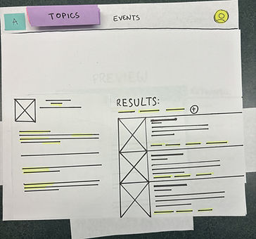
Search results (before)
Search results (after)

In accordance with our new direction of keeping things simple, the "preview" of the file taken out of the search results page. We did this in hopes to reduce distractions that may cause confusion and clutter.
Prototype Walkthrough

Style guide
Typography
Poppins Bold (Heading 1)...............................................................................................................................20pt, 30pt, 50pt
Poppins SemiBold (Heading 2)..........................................................................................................................16pt, 30pt, 40pt
Poppins Regular (Body).........................................................................................................................................................16pt, 30pt, 40pt
Color
#12492F
#C0FF0F
#E0F0E9
#E4FAA6
IMPACT
How does GrownUp. address the user needs?
1
Provides accessible and straightforward articles for anyone to read to quickly become familiar with the relevant topics.
2
Presents the relevant topics in a simple way for users and breaks down each component in managable articles.
3
Scan feature helps users make sense of documents that are foreign to them so they can head in the right direction.
4
Users can save articles to locate the relevant information with minimal effort.
Takeways & Learnings
What worked well
Each team member has a differing background and brought new perspectives to the case study.
We were not discouraged when certain problem areas persisted through different usability tests.
Compromises were made when team members disagreed on design decisions through constructive conversations.
Challenges
Team members with varying technical design knowledge proved challenging at certain stages to work efficiently.
Disagreements in design directions between team members stalled progress at times.
We found ourselves assuming things about the our users at times and had to take steps back to reevaluate decisions.